
It’s a noisy world and everyone (and every thing) is clamoring for our attention. This rings true for transit riders. They’re responding to emails, listening to podcasts like [shameless plug alert] The Movement Podcast, checking text messages, browsing Reddit—all while using your transit services.
Your riders may need the comforting therapy of cat memes after a long work day, but they also need up-to-date, comprehensible information about service changes, safety protocols, new technology, and more.
Getting their attention isn’t as simple as creating the world’s biggest bus stop poster or bombarding riders with pop-up messages on their rider app. To create attention-grabbing marketing materials, you need to know what marketing strategists and designers already know: the use of fundamental design principles makes for memorable marketing assets and impactful messaging.
Let’s use marketing assets developed by our all-star graphic designers at TransLoc Marketing Services to illustrate some of these design principles in action.
Hierarchy
This is an Inception moment where we’re talking about hierarchy using hierarchy—that is an ability to determine how to creatively emphasize primary versus secondary information. For example, headings and subheadings are one way marketers and designers draw a person’s attention to content and entice them to learn more.
Balance
Isn’t it a mood killer when you’re seated at a wobbly table inside your favorite restaurant? That’s because people generally prefer balance. Balance is also a cornerstone of effective design and essential for eye-catching composition—a.k.a., the placement of visual elements. Once a hierarchy is established, other less important elements can be placed selectively to keep information and design elements from feeling lopsided.
Color
Color communicates more than we realize. It can make a design feel warm and inviting or cautionary and brooding.It can tell a person to “have fun and join the party!” or “turn around and never look back.” The key with using color is remembering that less is more. Loud colors in combination can be distracting—tones are a better way to support loud colors. If you’re using a large type size or bold font for a headline (hierarchy!), avoid making it a loud color to further emphasize. The ultimate trick to using color? Knowing when enough is enough.
![]()
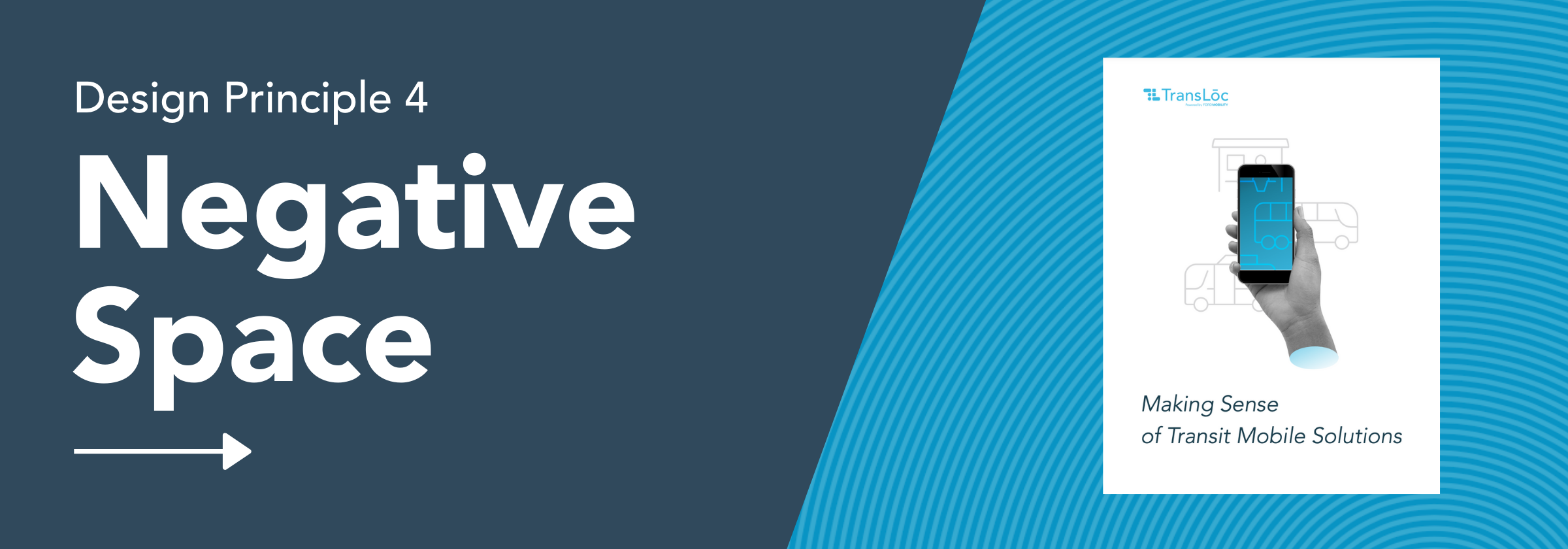
White/Negative Space
Because you’re designing an 18”x24” poster doesn’t mean you have to use every square inch of it. The concept of white space—or negative space—is less about maintaining emptiness and more about good editing and showing restraint. Avoid filling your material with content simply because you have the space. Our eyes get tired and they need a place to rest. Too much text or too many design elements in your materials will overwhelm your riders. When riders are overwhelmed, they’re not retaining information—and that means bigger headaches for you.
Now you’ve got a more discerning eye for what constitutes good marketing design, but there are many more design principles to learn (not to mention basic communications principles too)! We respect that your transit agency has to spend every waking minute of its day thinking about the mobility of your community, and that you may lack the time or personnel to truly take advantage of your newfound design knowledge.
Our Marketing Services team is an affordable solution for your transit agency to achieve its marketing goals. Instead of being paralyzed by the overwhelming options found in design platforms like Canva, use our Marketing Campaign Builder to implement your agency branded assets into first-class, transit-focused design templates. Coordinate rider surveys in 100 different languages via our collaboration with PublicInput.com and receive valuable analysis that can be shared with stakeholders at all levels. Or, if you’re gearing up for a major service launch, partner with TransLoc Marketing Services for an all-encompassing marketing campaign with tactics that will educate and inform your riders, community stakeholders, and administrative and dispatch staff.
With decades of advanced marketing strategy and design experience on its résumé, Marketing Services can create customized and cohesive marketing campaigns featuring digital and print assets that will earn the trust of your riders. Let’s start our design journey together!